ICHIBAN RAMEN PACKAGE DESIGN
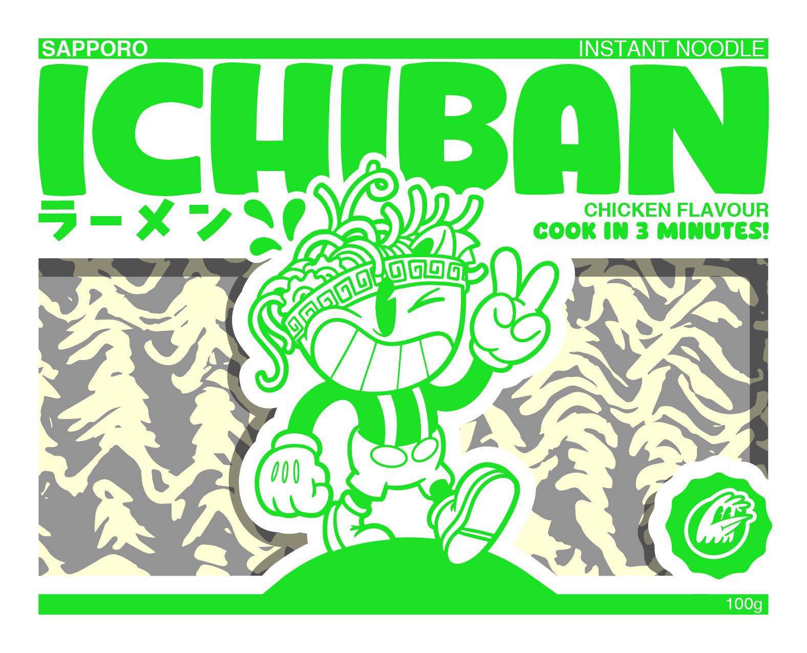
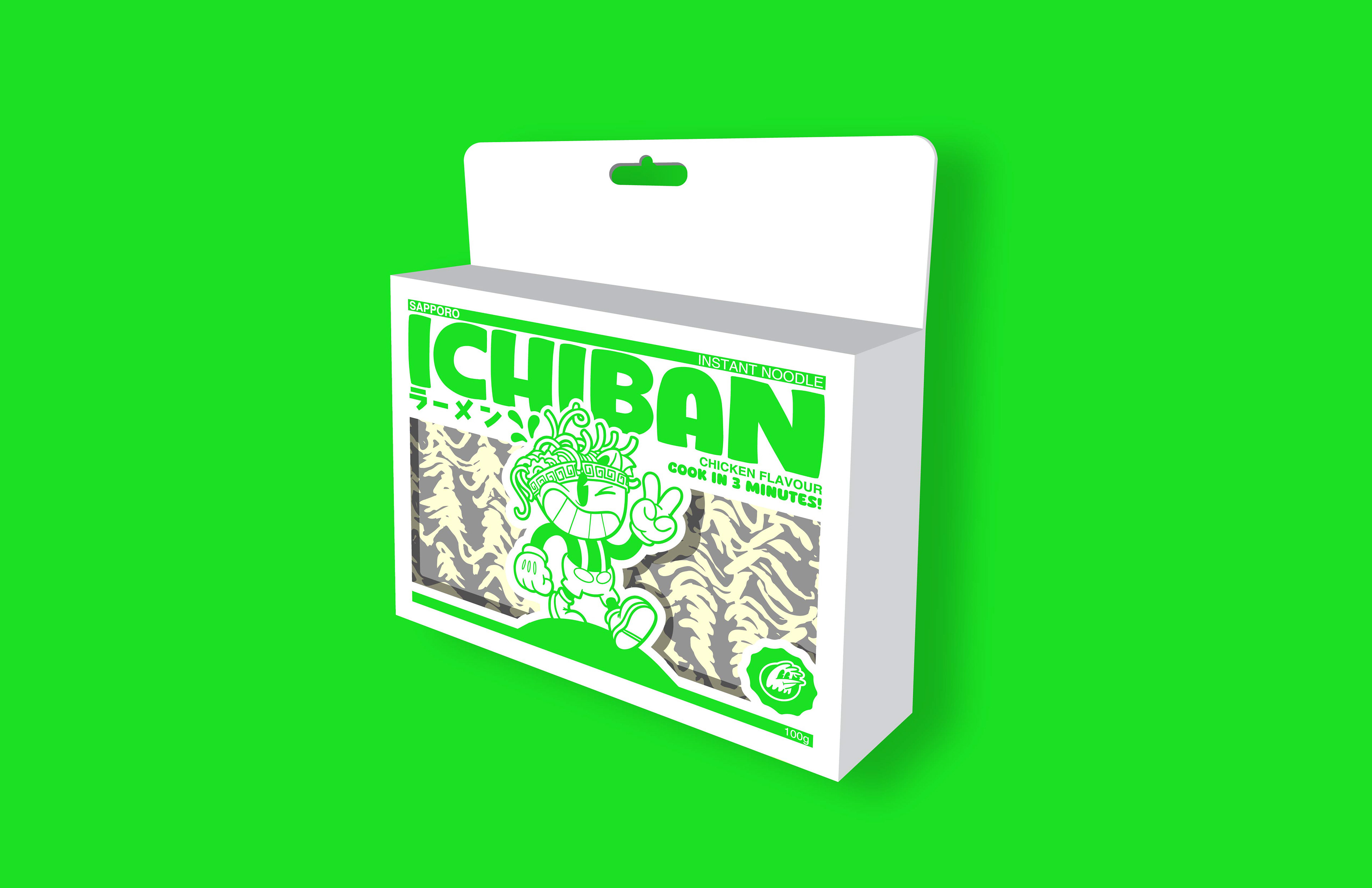
In the world of instant ramen, packaging rarely strays from two common formats, often chosen for cost efficiency or convenience. Good God Graphics set out to challenge this standard by merging three different worlds of packaging: Italian pasta, Japanese ramen, and toy/product design.
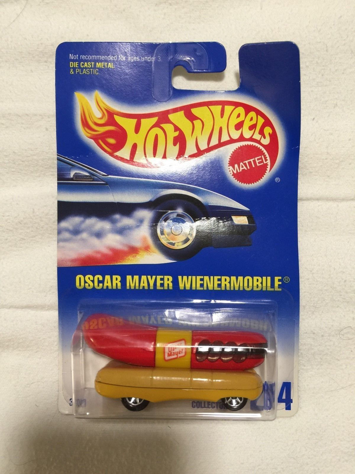
The concept highlights the beauty of dried ramen noodles through clear packaging that doubles as a bowl. Inspired by toy packaging, the design can hang on a hook like items in the toy aisle, or fit naturally into a spice section in the grocery store. It’s also designed to work seamlessly in vending machines. This approach makes the product engaging for consumers, efficient for manufacturers, easy to stock for retailers, and exciting for designers to produce.
The design draws inspiration from classic Sapporo Ichiban packaging, which often features serif fonts, loosely placed type, and heavy imagery. Good God Graphics reimagined this with a modern Japanese design sensibility, using a grid system, Japanese characters, and a minimal yet striking layout. Visual cues from ramen noodle shops in downtown Tokyo informed the style, giving the packaging a clean but intriguing personality.
Behind the Scenes

