EGG BAG BRANDING
EGG BAG Branding began as the brainchild of two friends after a late night turned into a breakfast experiment. While making egg and bagel sandwiches, the jokes started rolling and the slogans followed. “We took the L out of BageL because we don’t take no L’s.” “We put the EGG in the BAG so you don’t have to.” From that moment, EGG BAG was born.
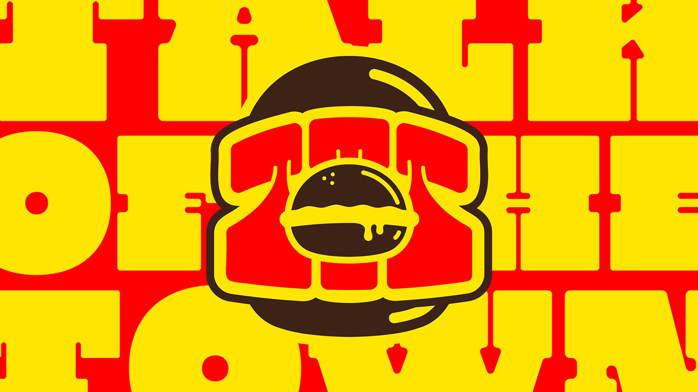
Good God Graphics took the idea and ran with it, creating a brand identity that feels as thick and satisfying as the sandwiches themselves. The custom typography has weight to it, like a fried egg sliding out of a bagel, and the colour palette revolves around a bright, unapologetic yellow that makes the whole brand pop.
EGG BAG is playful, greasy, and unfiltered, just like the kind of breakfast you crave after a long night. The branding captures that energy, from the slogans to the type to the packaging, creating a concept that feels like it belongs right alongside the modern egg sandwich giants.


Photography from unsplash.com and Pexels.com
Girl with Red Hat, Andrea Lacasse, Dan Gold, Nicole Jacobi, Vicky Ng, Pexels Kelly, Lau Clrd, Daryl Han
Mockups from unblast.com Font for Personal Use: CS Broke
Behind the Scenes


