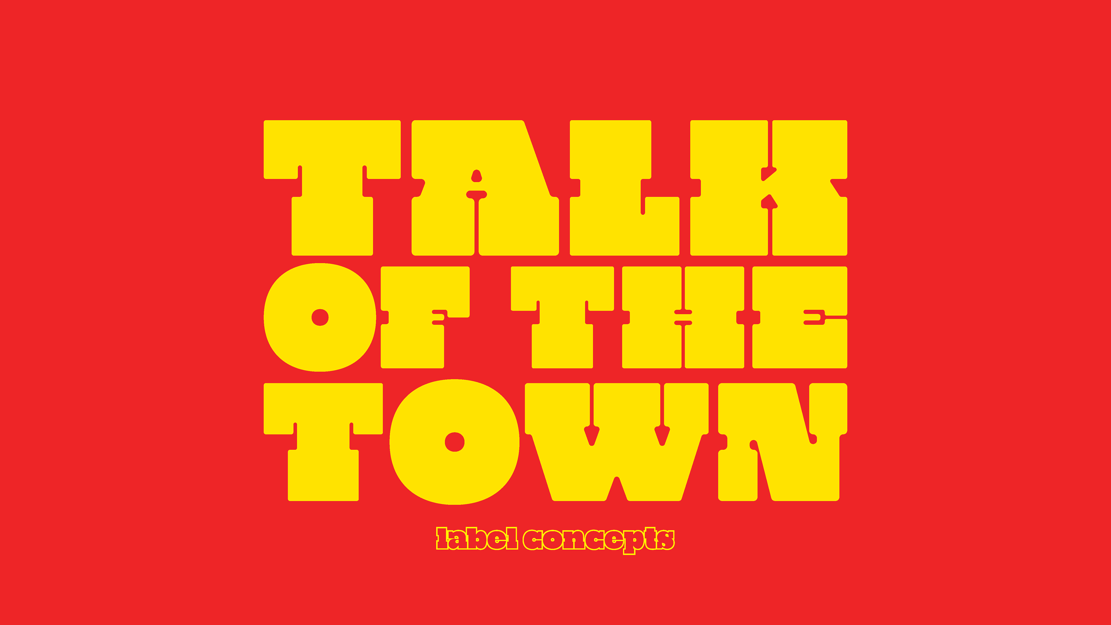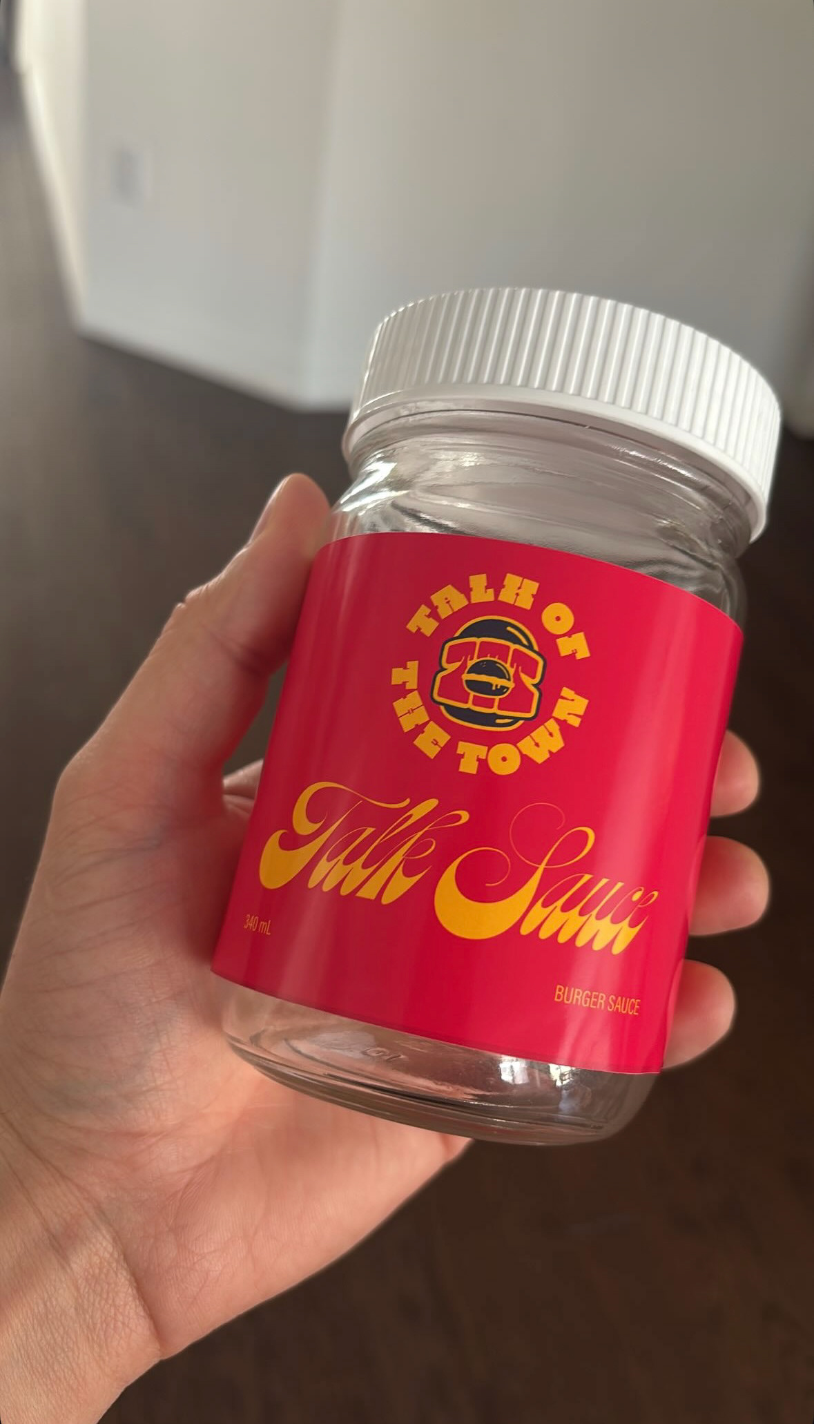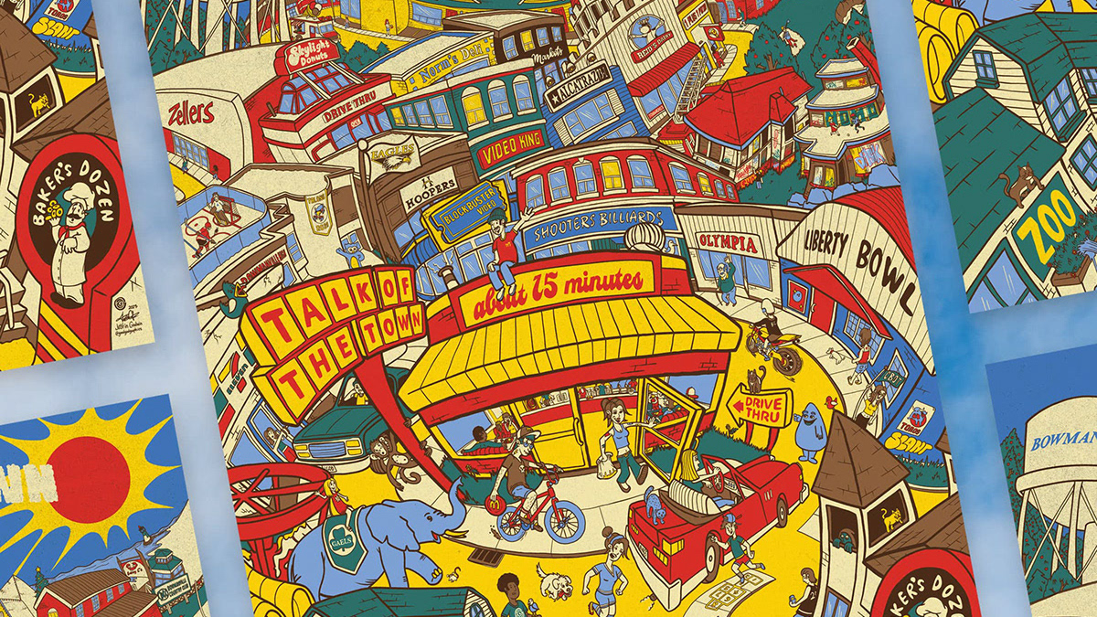

TALK OF THE TOWN | BRAND IDENTITY
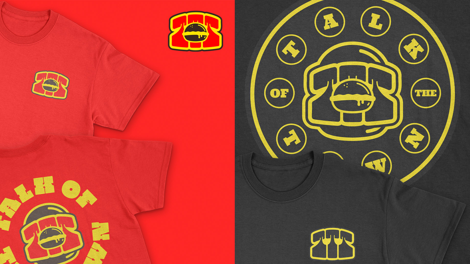
Talk of the Town is clearly a brand that is bold and larger than life. Their flavours are unmistakable, and they have an incredible loyal following. The Talk of the Town logo is inspired by these elements of the existing brand, complementing it perfectly. With Zach paying homage to the burger and takeout places before him, he sees value in the vintage and retro times of old, as we all should. I, too, value these joints, and Talk of the Town is revving up those fryers to get us all excited about good food done right.
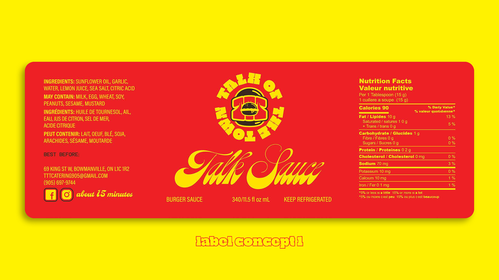
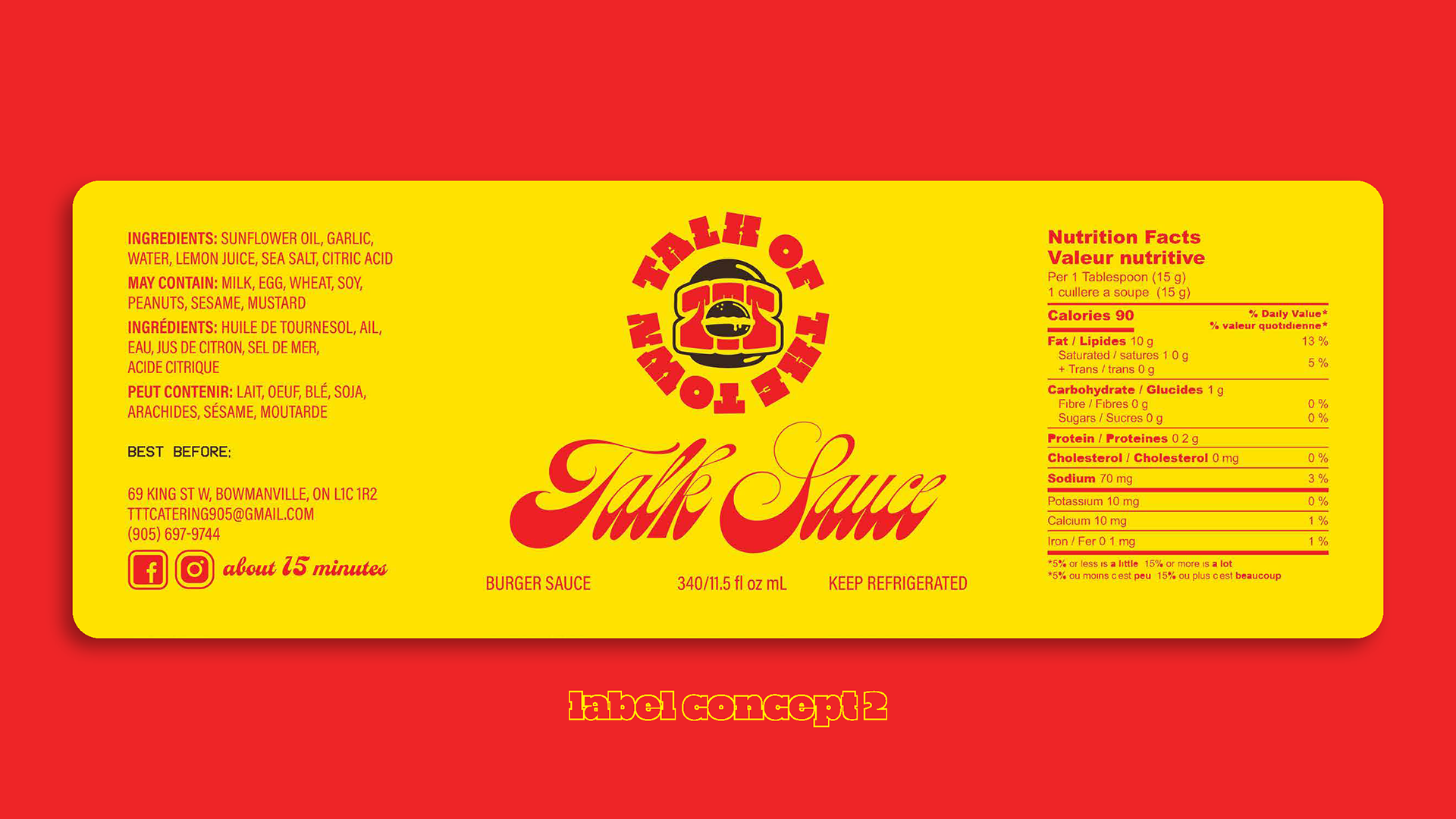
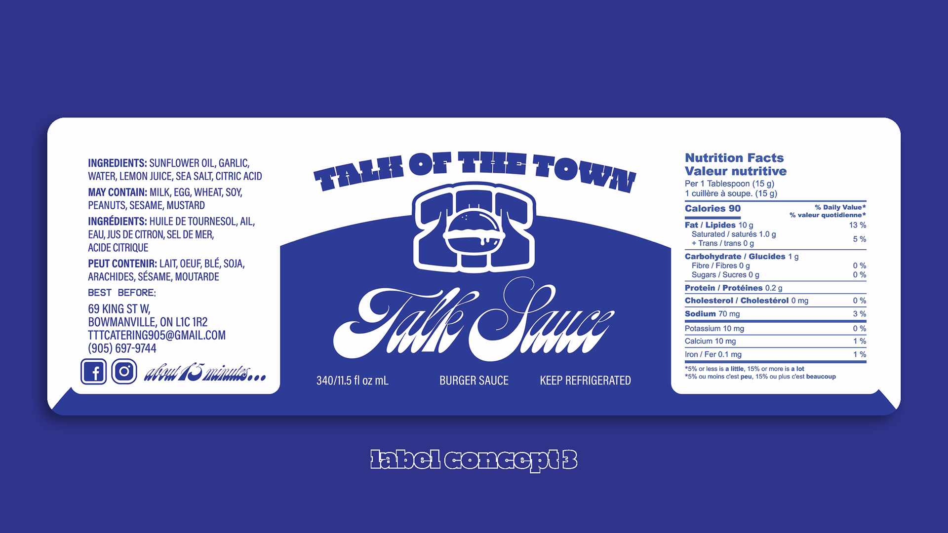
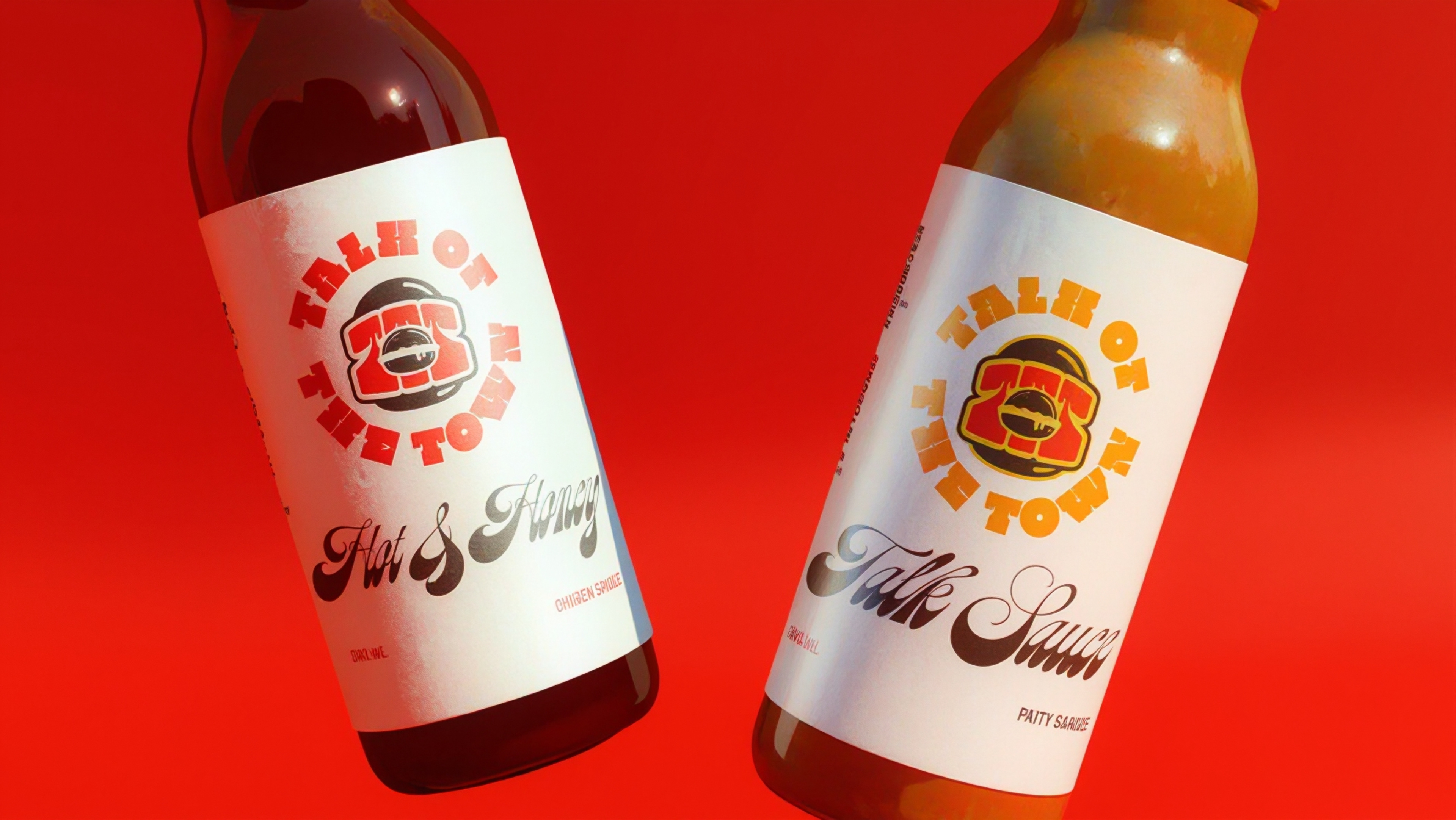
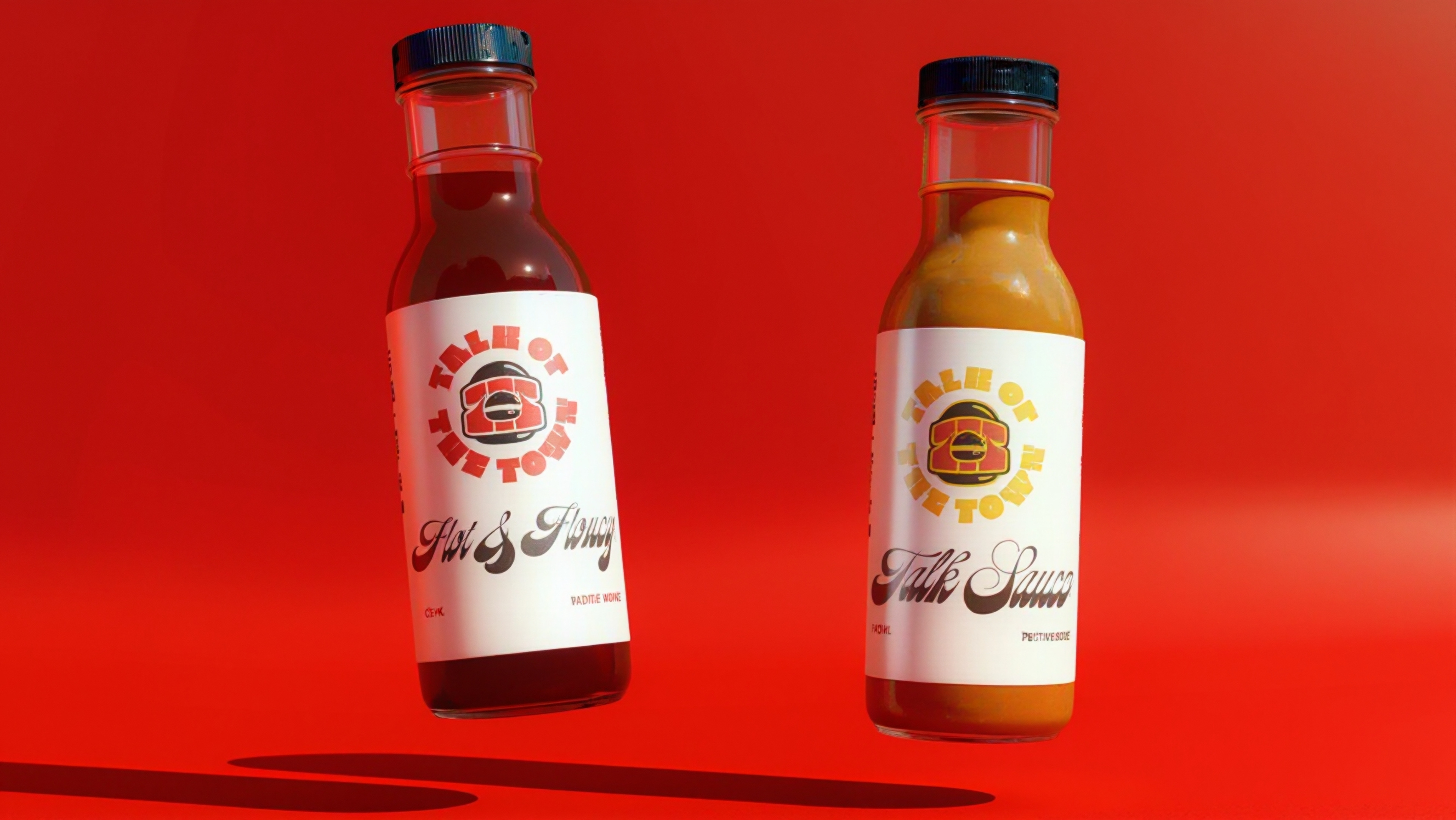
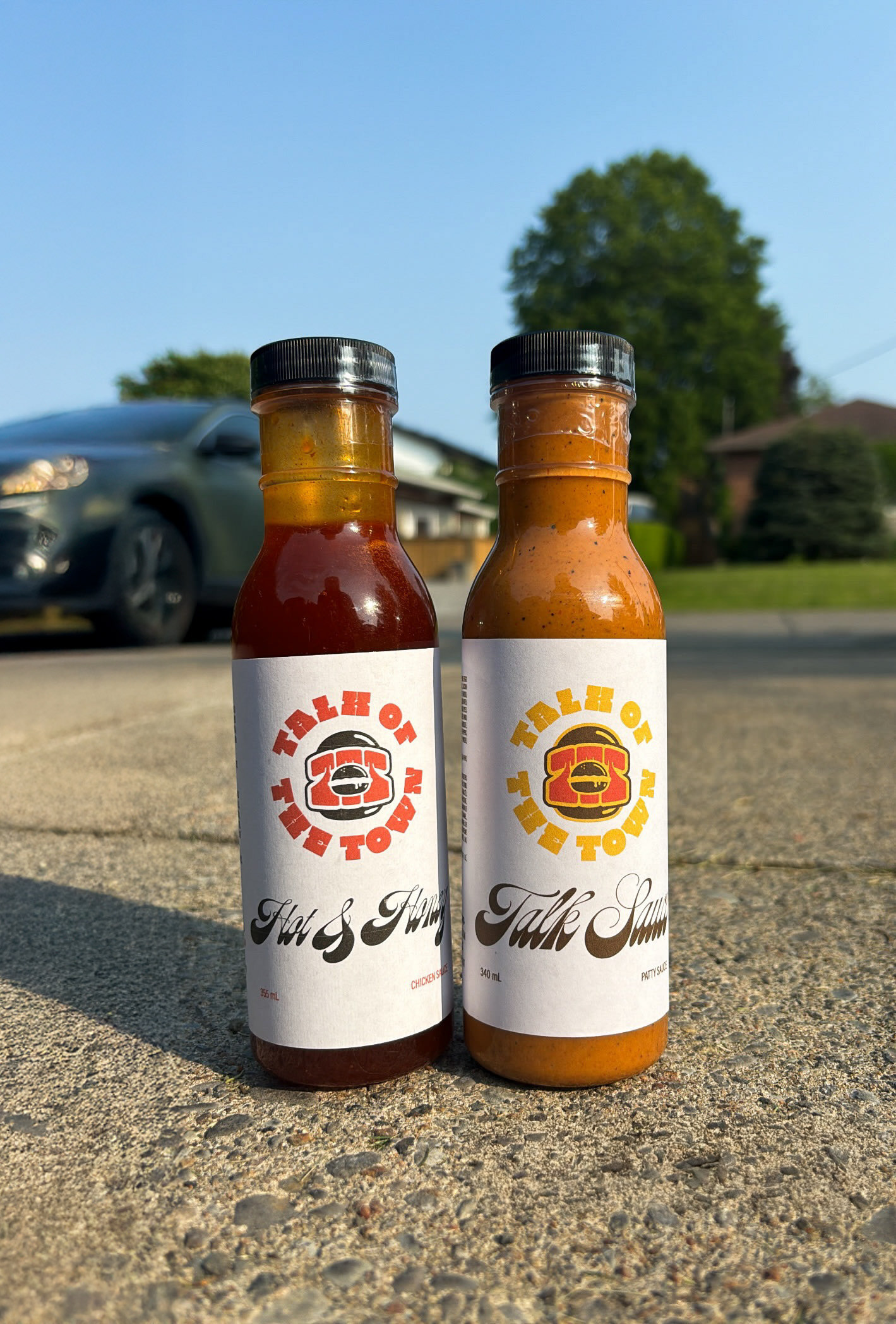
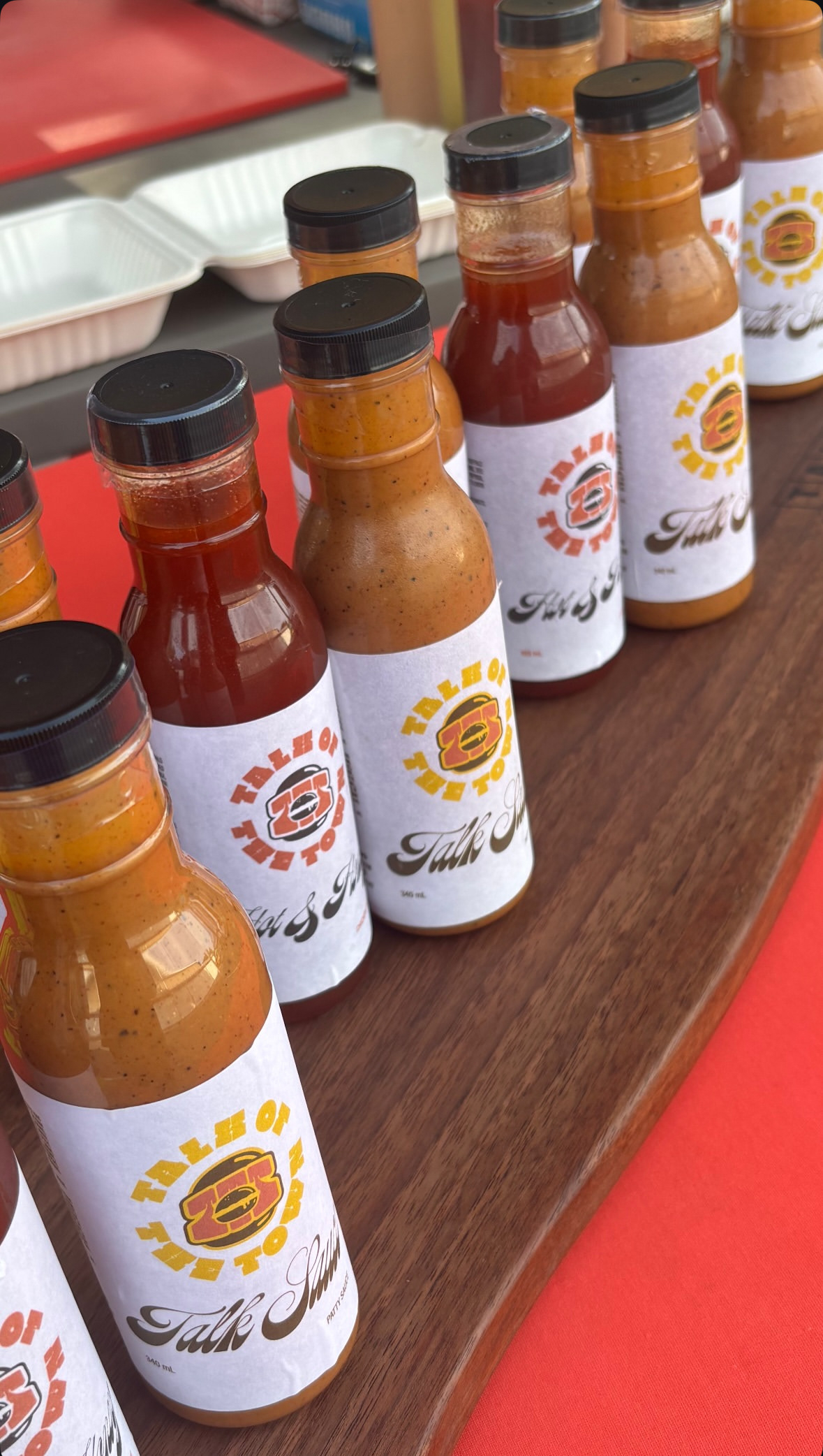
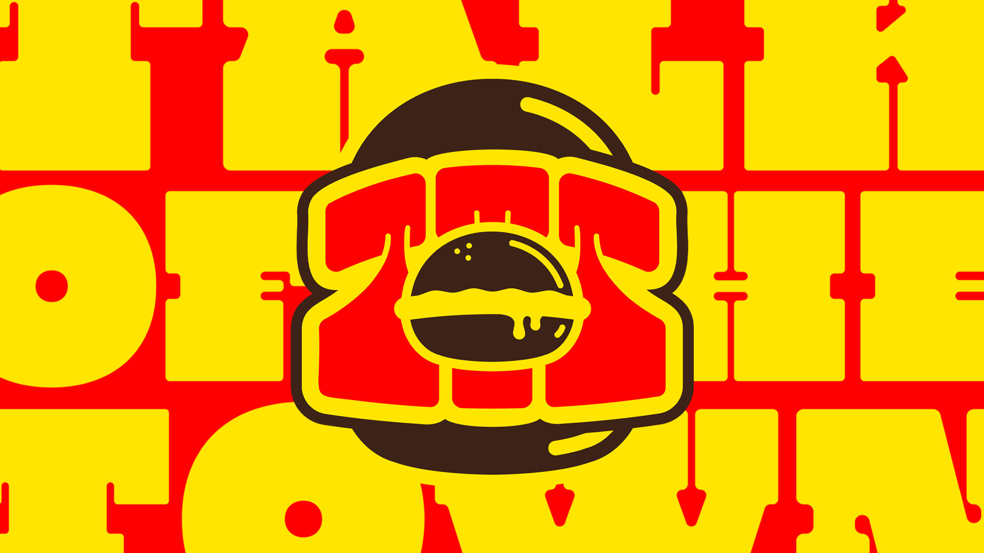
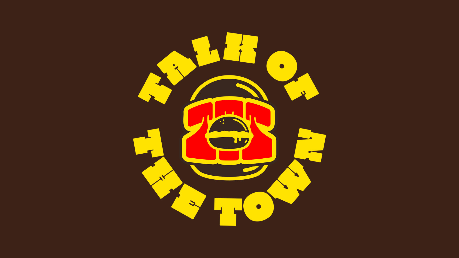
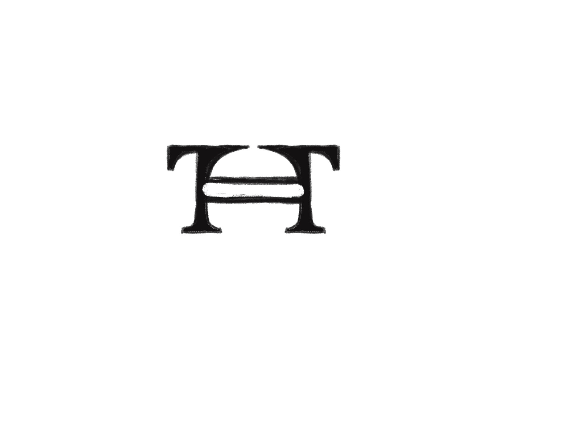
The Talk of the Town logo is based on the Burger Giants who came before us, as well as the mom-and-pop shops that keep grinding every day. Talk of the Town is not limited to just burgers, though, which is why this logo embodies all takeout places. It’s an all-encompassing design that represents the very essence of this food destination, “THE TALK OF THE TOWN.”
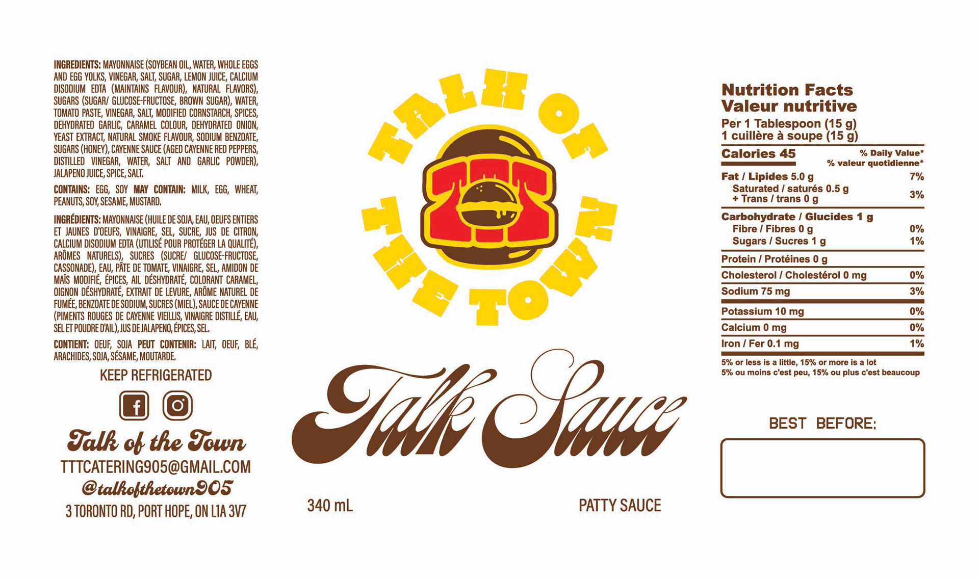
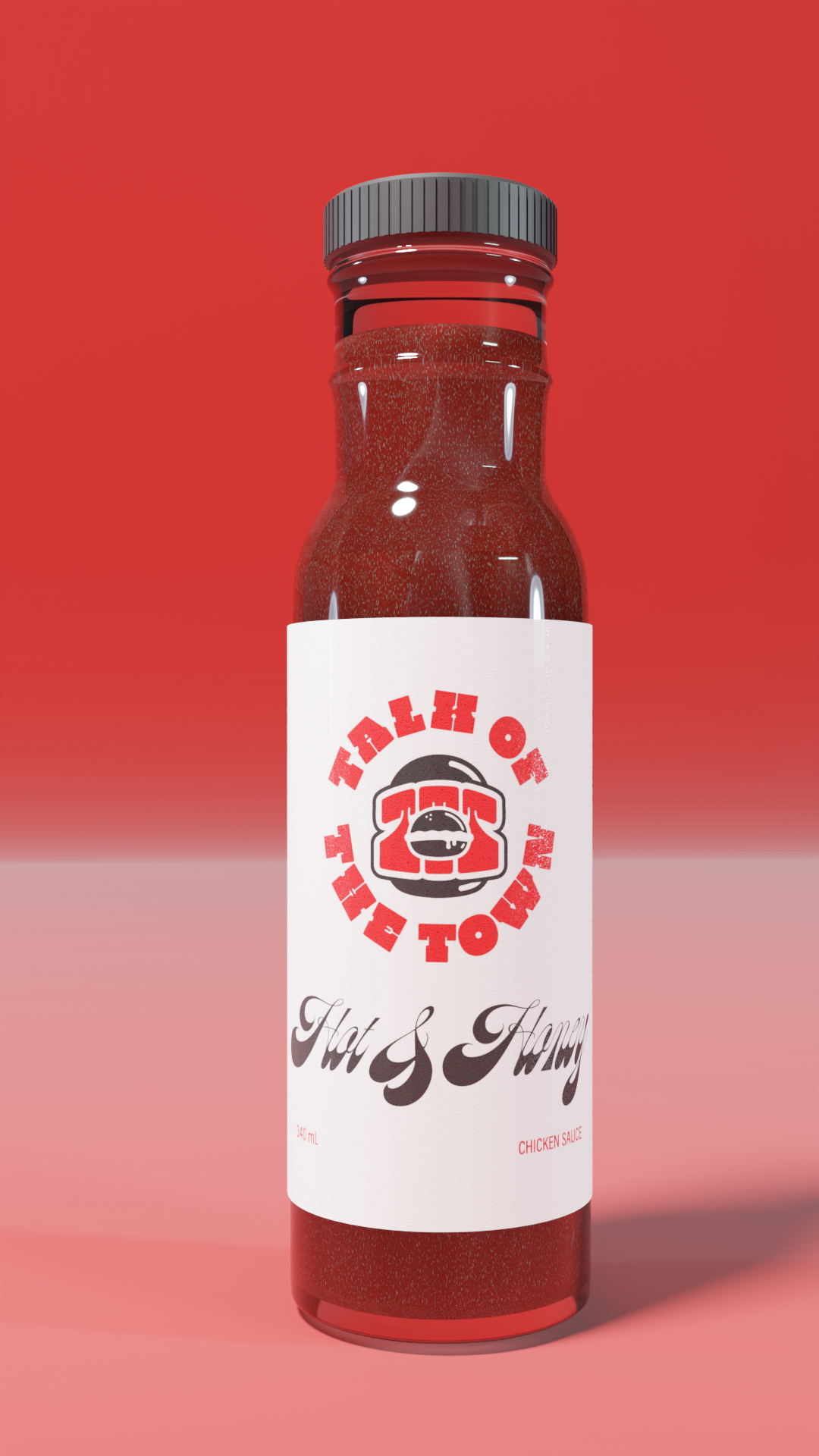
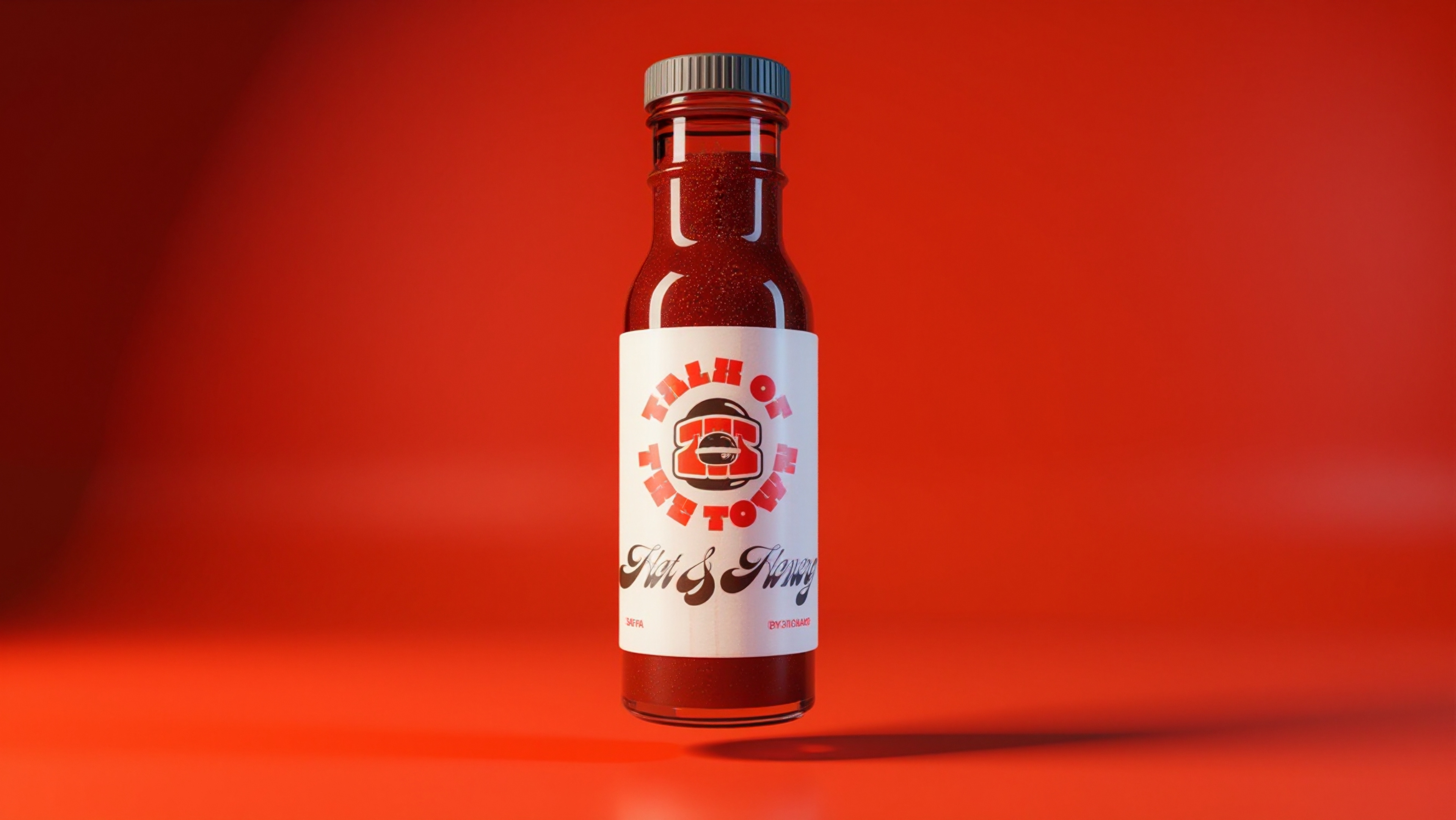
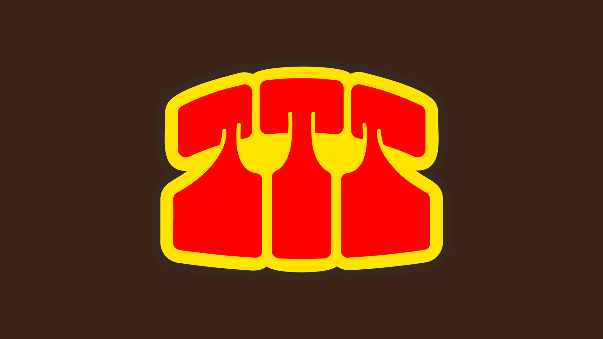
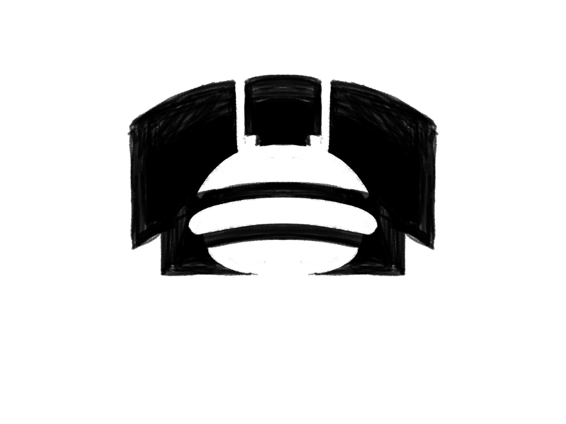
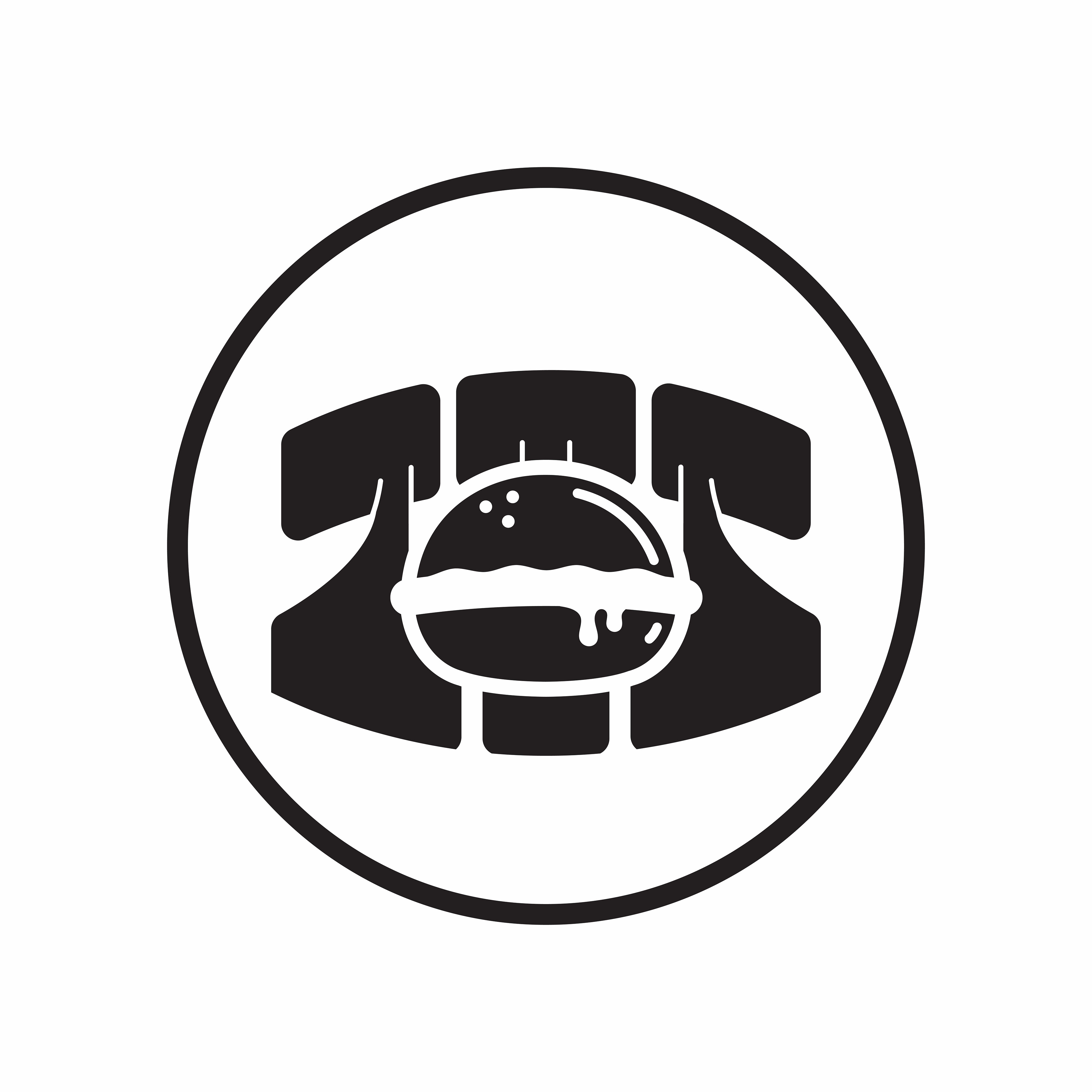
This logo, combined with an old-school vintage rotary phone, symbolizes the need to call in, pull up, and come through. The type is based on a thiccc retro slab serif with graffiti elements. There are five versions of this logo, from the “Classic Triple T” to the “Sandwich Rotary.” This logo best represents such an iconic takeout spot, paying respect to old-school joints. It is also designed to stand out on food packaging, with its highly scalable and easily recognizable design.
"This is why I only deal with you only, you're the best." - Talk of the Town

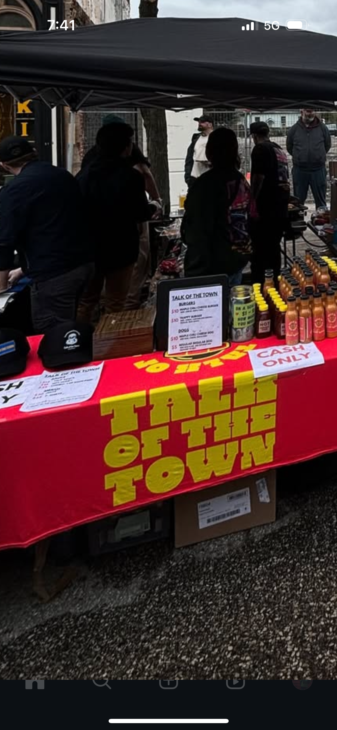
Behind the Scenes


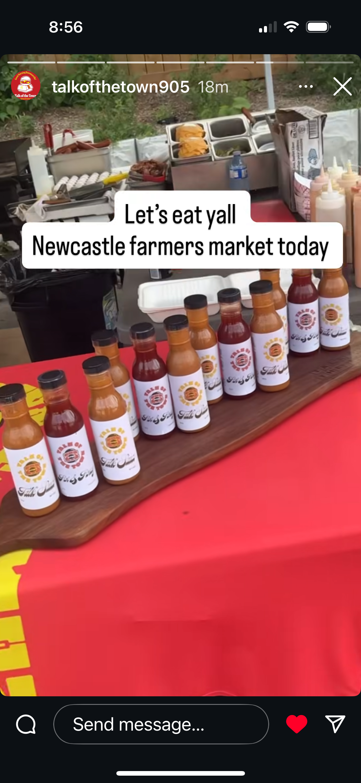
Label Design (unfinished portfolio piece)